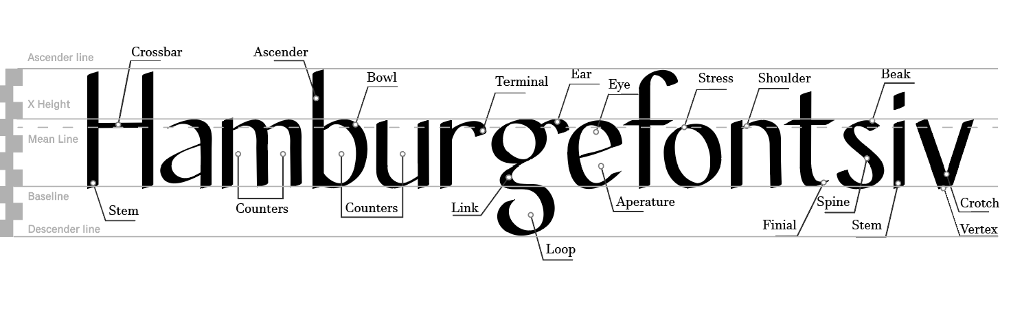
This is the labeled "Hamburgefontsiv" word.
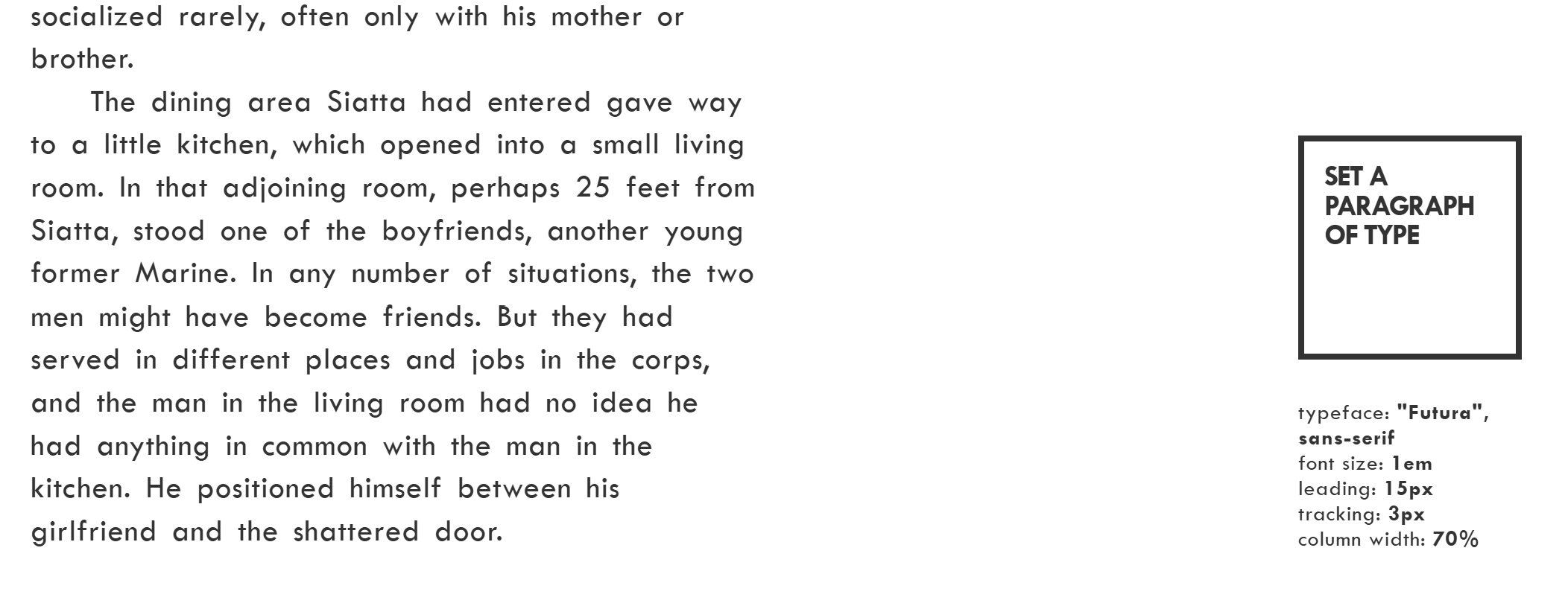
Initially, the colum width of the paragraph was 70% and the tracking was 3px.
I changed the width to be wider to occupy more space in the page and for it to be closer to the description box.Instead of addind spaces I used indents to
separate the paragraphs from each other. Deleting the indent on the first paragraph was complicated at first butI added a span with a negative indent to delete it and that worked.
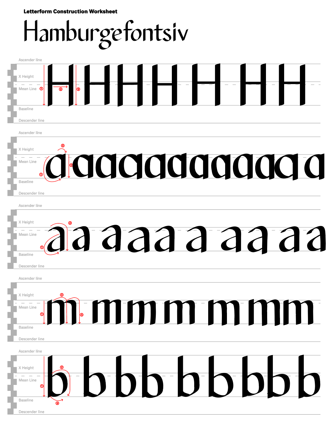
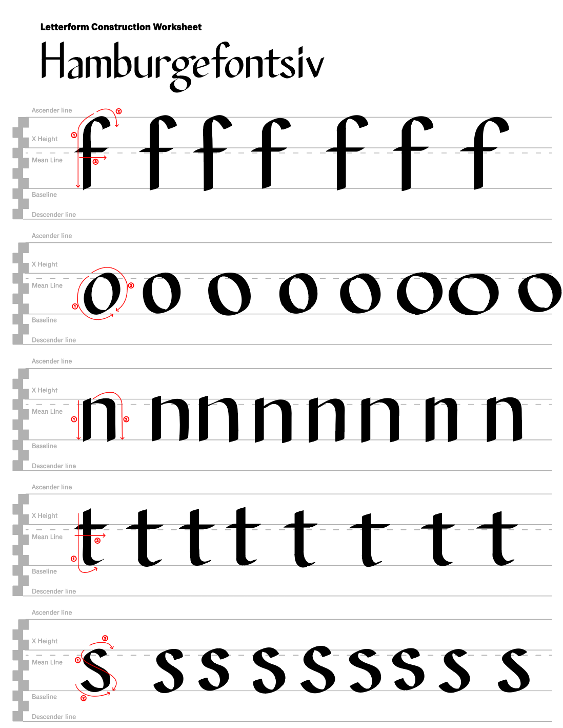
This is the first sheet used to practice creating the letters for the "Hamburgefontsiv" in Illustrator. In this page the most complicated letter to recreate for me was the "b".
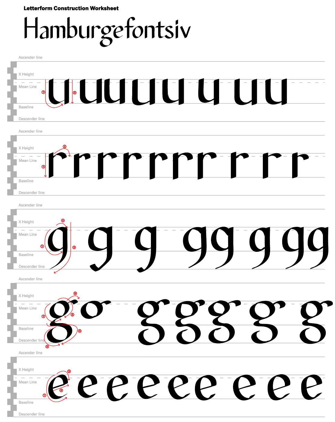
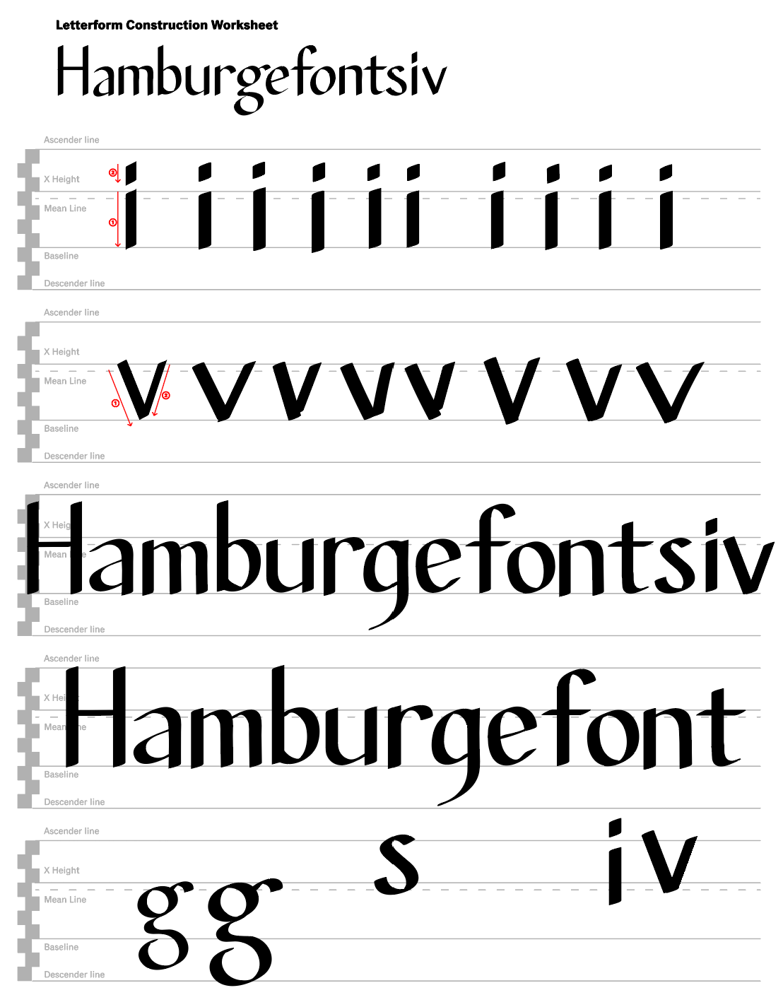
This is the second sheet used to practice creating the letters for the "Hamburgefontsiv" in Illustrator. In this page the most complicated letter to recreate for me was the "g".
This is the third sheet used to practice creating the letters for the "Hamburgefontsiv" in Illustrator. In this page the most complicated letter to recreate for me was the "o".
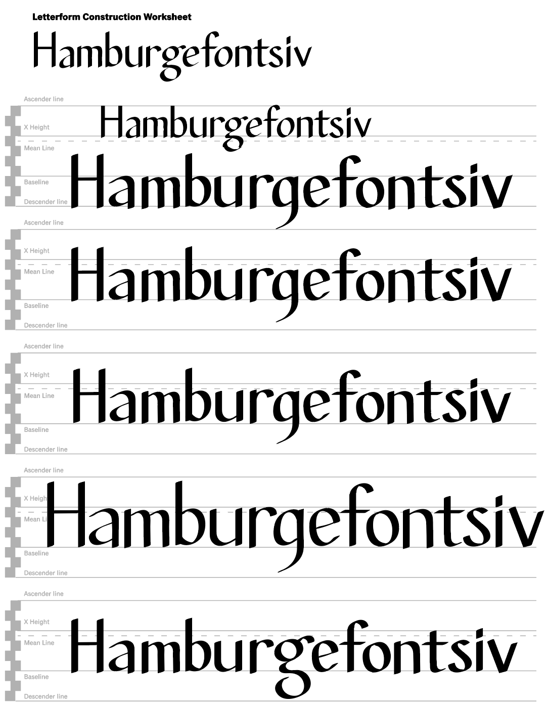
This is the fourth and last sheet used to practice creating the letters for the "Hamburgefontsiv" in Illustrator. This page also includes experiments with the spacing (tracking) of the letters in the word Hamburgefontsiv.
This is the fifth sheet used to practice creating the letters for the "Hamburgefontsiv" in Illustrator.
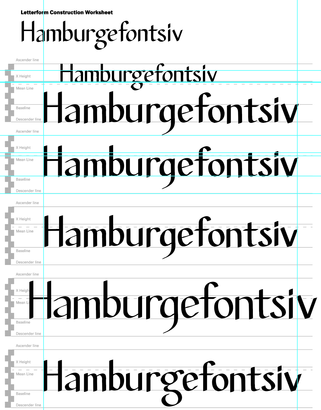
This is the fifth sheet used to practice creating the letters for the "Hamburgefontsiv" in Illustrator. This image includes the Illustrator guides that helped me align the letters and adjust the spacing.